

Ideally, you never want your users to see error pages. But if they do, then there is still an opportunity to turn a negative experience around by providing something useful or entertaining. Here's a list of our favourite examples...
Top 5 error pages on the web
You’re browsing a website and perhaps you take a wrong turn or something just goes wrong and you find yourself at an error page. Although you hope visitors never come across errors, sometimes they happen and what’s important is how they’re handled; users need to know what’s gone on, why (if possible) and what they can or should do next.
For example, if you find yourself visiting a URL that doesn’t exist, you’ll usually see an error page that talks about 404 – which is the error number code – and ‘Page Not Found’. However you ended up there, you need to have some options available to be able to continue your web journey. This could be a list or other pages to try or a contact number for support.
Typically, error pages tend to be dull and lifeless, confusing, or look a little like The Matrix with their walls of technical explanations and error codes.
But they don’t have to be. By injecting a bit of levity or trying to delight users after their unexpected error, these pages can help keep users going and get them back on track, whilst also helping them understand what went wrong and why.
With that in mind, we’ve scoured the Internet to bring you our top five error pages, as well as a little example of some rejuvenated ones from our very own websites and applications.
1 – GitHub
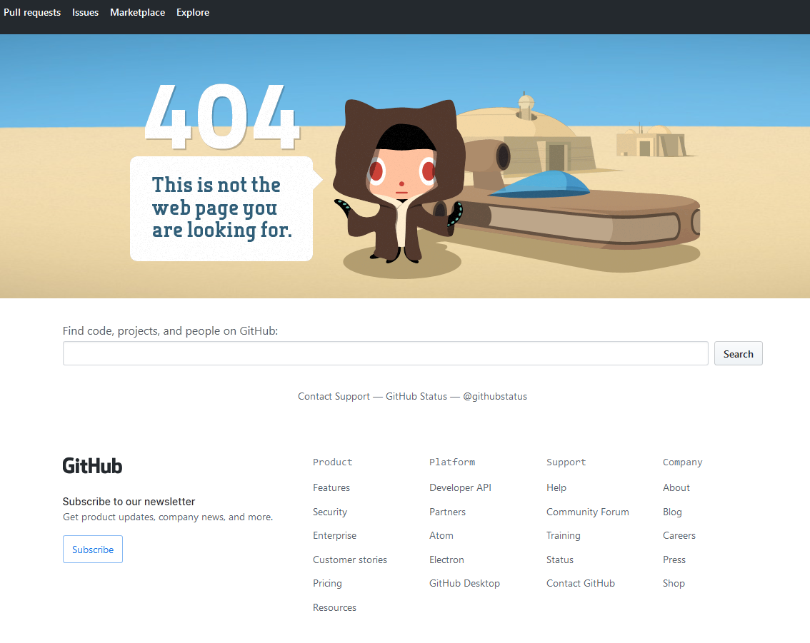
What would a ‘top error pages’ article be without mentioning GitHub’s 404 page? Whilst it does have a helpful list of common links and a search bar to get to back on track, it’s their mascot, the Octocat at the top of the page that steals the show.
Not only is he sporting a Jedi robe, set in a Star Wars theme, but you can play with some nice movement and scroll effects by moving your mouse around in the scene.
2 – Hot dot

Hot dot are a web development and digital artist agency in Russia. Whilst there site is borderline art on its own, it’s their interactive 404 page that stands out.
By visiting a page that doesn’t existon their site, you’ll be treated to a parallax, moving, morphing collection of bubbles forming ‘404’. You can click on them, pop them, and it’s all quite soothing to be honest.
3 – Good Dog Design
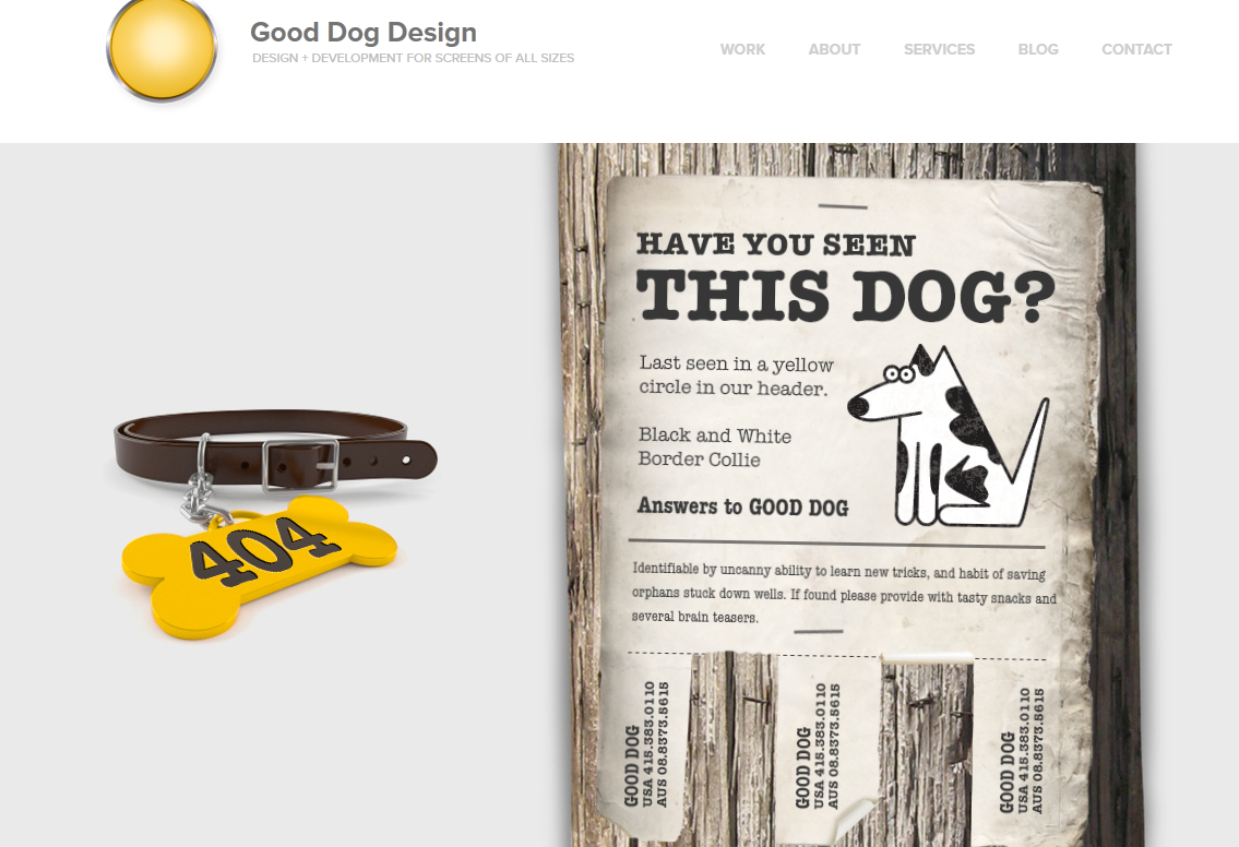
A US-based design and development house, Good Dog Design’s missing page is another great example of getting creative whilst staying on brand. We’ve got the clear error message (‘404’) on the collar and some flappy, interactive phone numbers that you can click on and play about with at the bottom of the poster.
4 – Sygic Travel Maps
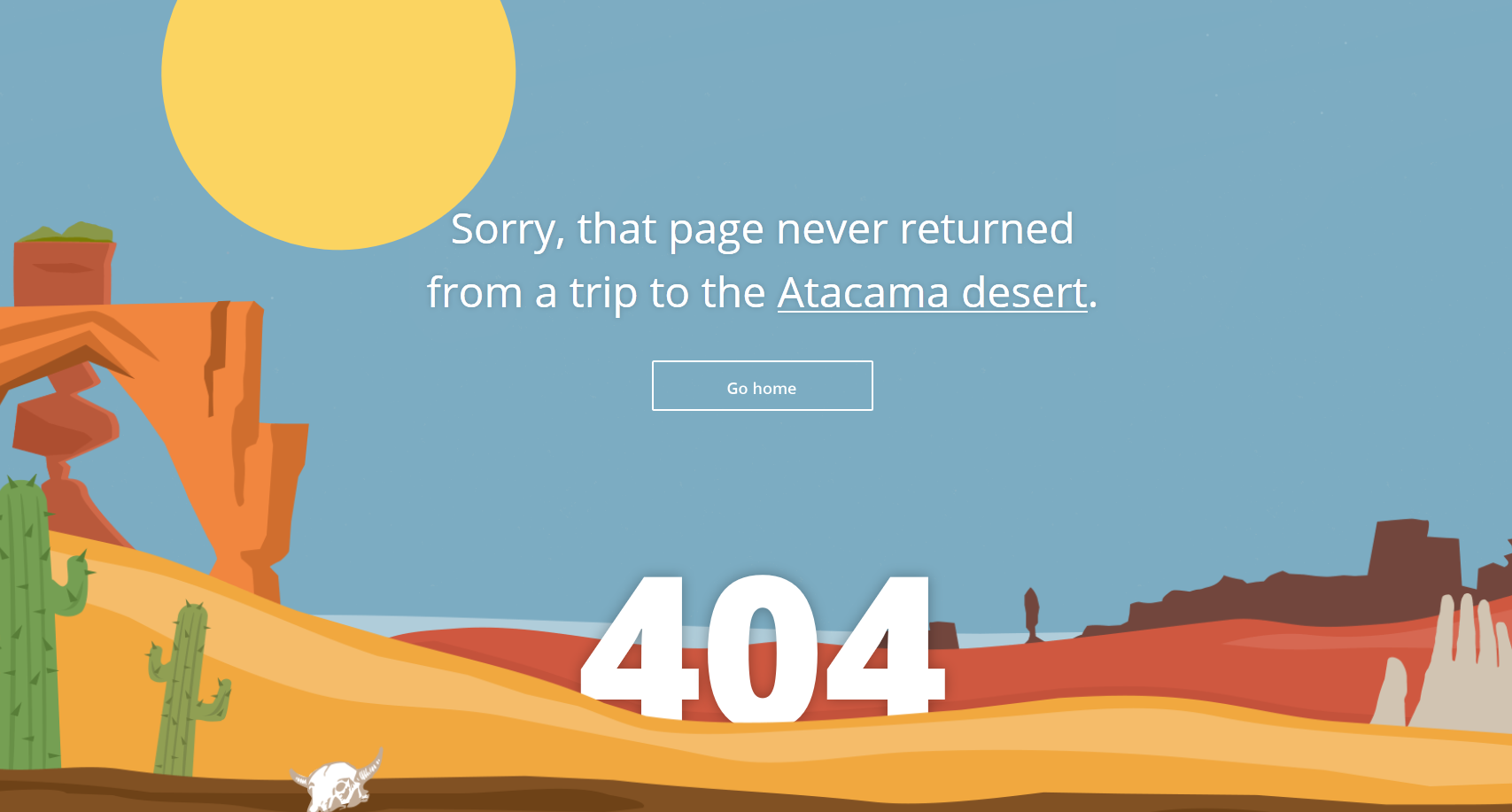
Another of our favourites. The Sygic Travel Maps site offers a beautifully illustrated page not found. It’s simple and to the point with the familiar error code and a link to the home page.
However, the icing on the cake is the shifting desert scene. In about 30 seconds, the sun rises and sets, transforming the desert from blazing sun into star-spangled night.
5 – Distilled
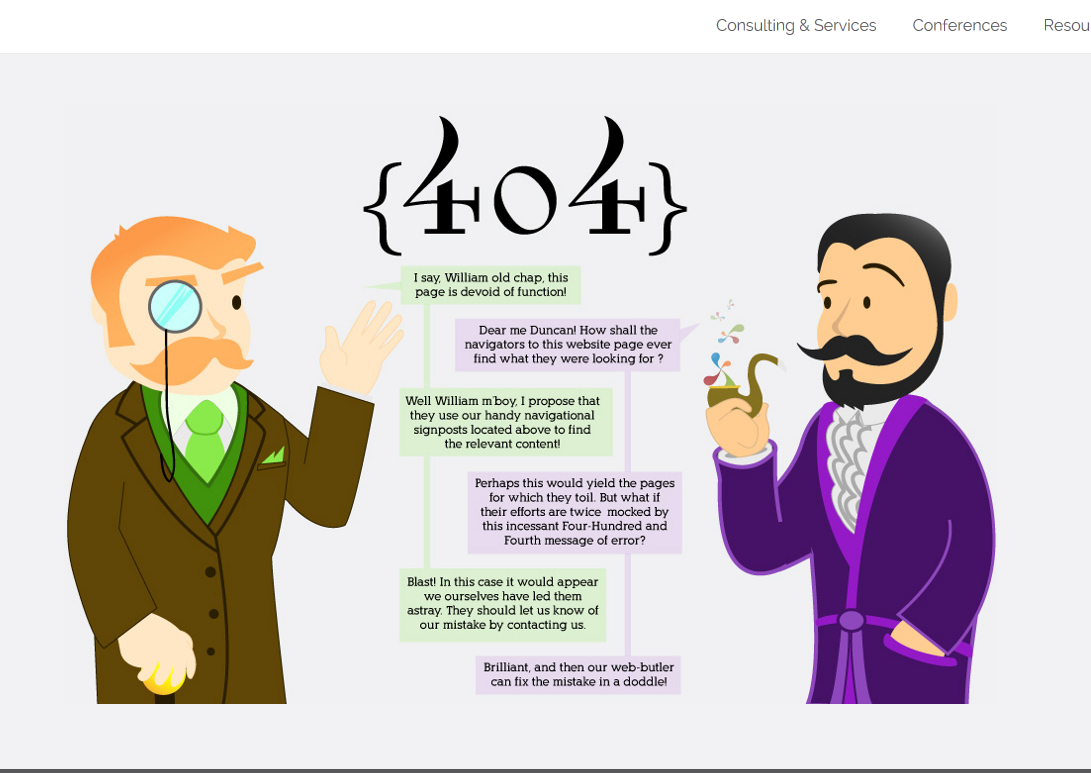
Another graphic design and marketing agency, Distilled have gone in a conversational direction with their error page.
If you happen across a page that doesn’t exist, you’re presented with a scene featuring two well to-do gentlemen discussing the error using a more modern, Whatsapp-esque chat.
Helpful and quite funny.
Errors at IAM Cloud
Meanwhile, here at IAM Cloud, we’ve been revamping some of our error pages, such as our 404 page below:
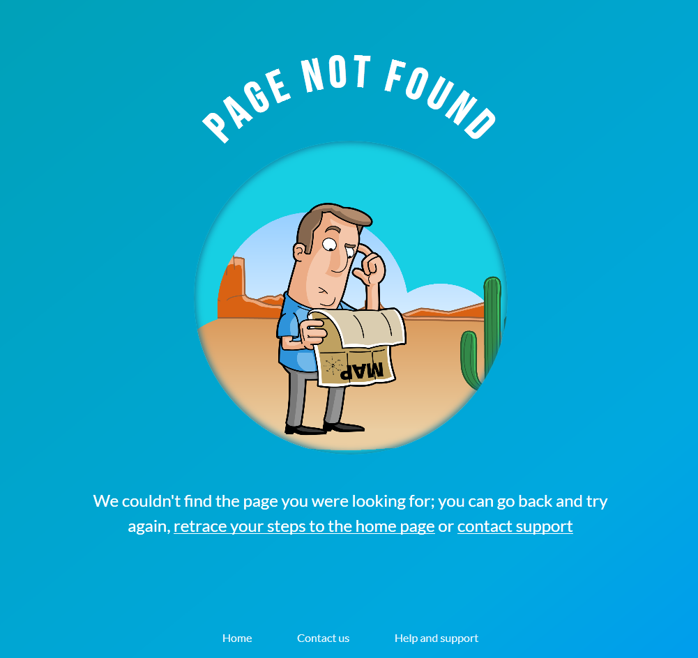
We’ve refreshed the design with our updated branding but kept the familiar illustrated feel. The curved text and circular, debossed design offer something a little different than the norm, but still give our users direction as to what’s happened and where they can go next.
Let us know what you think and if you have any examples of clever or creative error pages you’ve seen out in the wild.